Packaging design with less indulgence but more honesty?
- Katja Wagner

- Jul 13, 2025
- 1 min read
Relaunch of the VOLVIC Juicy range
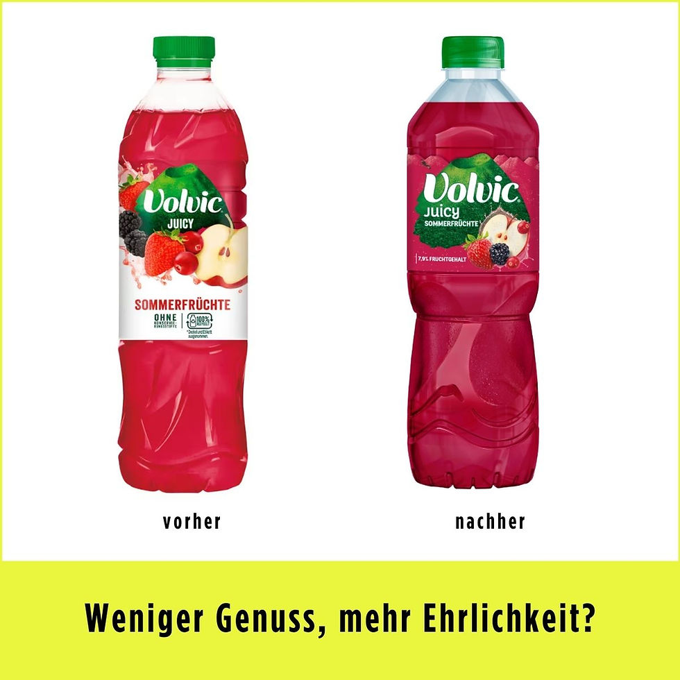
The current relaunch of the packaging design of the Volvic Juicy range is a good example of the balancing act between the promise of enjoyment and transparency :
👉 Stronger branding: The logo and volcano—both distinctive brand assets—have been enlarged despite the smaller label. This strengthens brand awareness, but at the expense of variety recognition and fruit visuals.
👉 Modernized typography , which, however, competes with the “Volvic” lettering
👉 Smaller label – and still less clutter: It's a good thing they didn't try to transfer all the information from the old bottle to the new, smaller packaging design. Instead, they prioritized the most important design elements.
👉 Less white, less freshness? By eliminating the white component, the new packaging design higher quality, but also less light and fresh.
👉 Smaller fruit = less flavor? The fruit images have been significantly reduced in size, conveying less enjoyment. However, this representation now more realistically reflects the actual fruit content. This is legally relevant and transparent.
My conclusion:
The new design tastes less fruity due to the smaller fruit images, but it's also more honest. And that's always commendable!
---
LinkedIn Post : June 25, 2025 by Katja Wagner


Comments